Project Brief
The CME Outfitters (CMEO) brand was updated as part of the overall rebranding initiative of the parent company, KnowFully Learning Group (KLG). With KLG now covering other education markets outside of accounting and finance, a unifying brand strategy was required. It had to acknowledge the diverse product offerings and demographics of the verticals, include strategy for incorporating newly acquired brands in the future, while still maintaining a coherent identity.
The new branding includes logos, color palette, design elements, and image style. The rollout included multiple website updates, presentations, sales materials, social media, video, product platforms, ads, along with other items.
Project Details
Skills
Palette
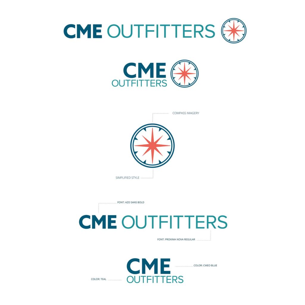
Our color palette was chosen to tie CMEO’s identity to the KLG brand, while still retaining the feel of CMEO’s distinct brand personality: strong, versatile, and engaging. The darker blue (Surgent Blue) is taken directly from Surgent’s original palette, and is the unifying color included in all of the palettes for KLG’s brands. CMEO Blue was the main color of the existing CMEO brand.
Logos
Proxima Nova had been used widely in Surgent’s marketing prior to the establishment of KLG, tying the new brand back to its roots, while still giving it a fresh, clean feel. Proxima Nova is a geometric sans serif font. It has high legibility and works well both in print and digital formats. It is available in 7 weights and combines well with other fonts to provide design flexibility. Azo Sans has also been used as an accent in Surgent design, and is a strong font with a distinct character that was a suitable callback to CMEO’s previous serif font.
The CMEO logo mark is a stylized compass, symbolizing CMEO’s ability to guide students in the right direction. The design of the mark ties back to the older CMEO branding.

CMEO serves several different audiences through its own grouping of brands and products. Additional logos carry across the strong CMEO brand.