Project Brief
The Surgent brand was updated as part of the overall rebranding initiative of the parent company, KnowFully Learning Group (KLG). With KLG now covering other education markets outside of accounting and finance, a unifying brand strategy was required. It had to acknowledge the diverse product offerings and demographics of the verticals, include strategy for incorporating newly acquired brands in the future, while still maintaining a coherent identity.
The new branding includes logos, color palette, design elements, and image style. The rollout included multiple website updates, presentations, sales materials, social media, video, product platforms, ads, along with other items.
Project Details
Skills
Palette
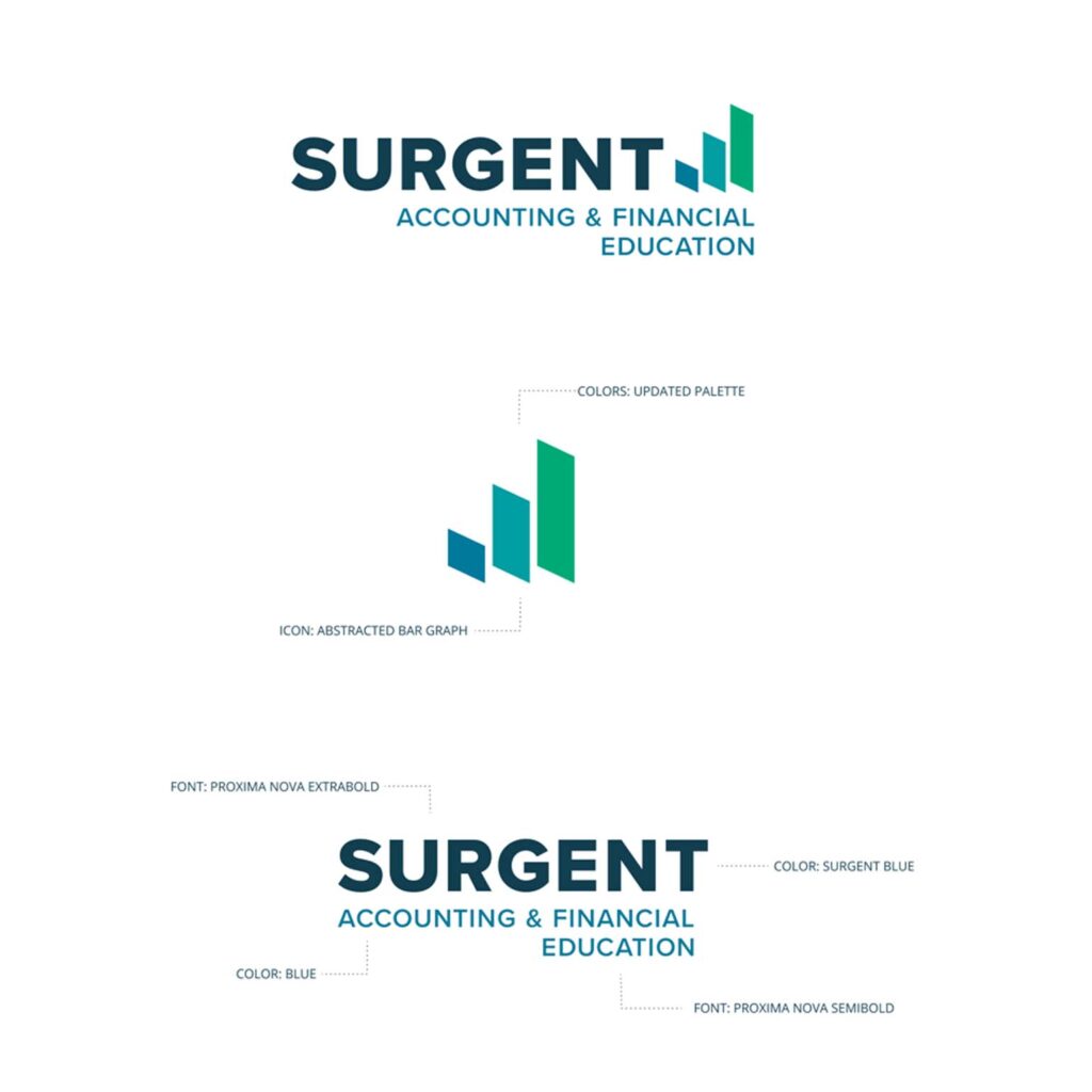
Our color palette was chosen to represent Surgent’s personality: competent, engaging, and current. The darker blue (Surgent Blue) is taken directly from Surgent’s original palette, and is the unifying color included in all of the palettes for KLG’s brands. Orange, a foundational color of the Surgent brand, was included and updated to a softer, more welcoming shade.
Logos
Proxima Nova had been used widely in Surgent’s marketing prior to the establishment of KLG, tying the new brand back to its roots, while still giving it a fresh, clean feel. Proxima Nova is a geometric sans serif font. It has high legibility and works well both in print and digital formats. It is available in 7 weights and combines well with other fonts to provide design flexibility. The Surgent logo features the same clean, modern font, and a dark teal (blue/green) primary color that is featured in the KnowFully logo.
The Surgent logo mark is a stylized graph, implying growth. Both the design of the mark and its shades of teal and green tie closely to the industry Surgent serves, including concepts of money, accounting, and finances.

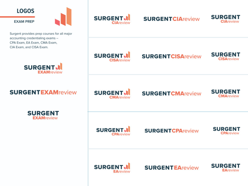
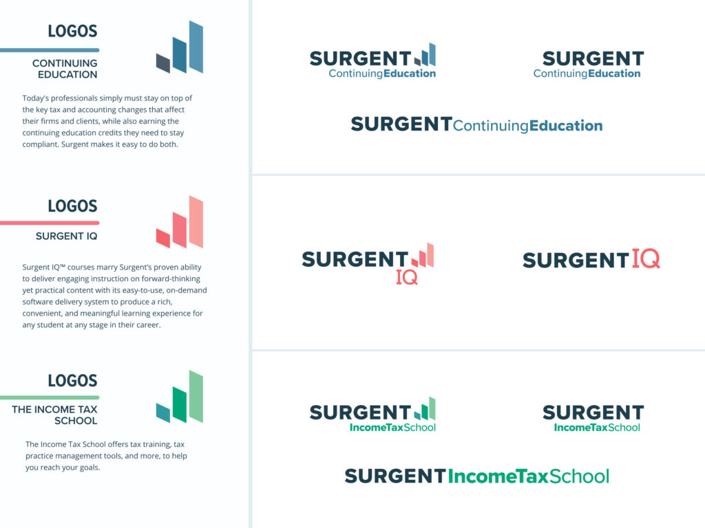
Surgent serves several different audiences through its own grouping of brands and products. Throughout the Surgent family, the “Surgent” part of these logos never changes; the color palettes and descriptive text do the work.